What is a vector shape?
A vector is a type of image. Vector images are graphical representations of mathematical objects such as lines, curves and polygons. these are generated by a computer and they follow X and Y axis as their reference definition. To this you can use Adobe Illustrator on any computer.
What is a pixel shape?
A pixels is one of the many tiny dots that make up and image in a computer’s memory. Pixels are different to vectors because a vector does not show any dots or pixel within any image. You will get pixels within Adobe Photoshop.
What is the difference between a Vector and Pixel image?
The difference between a vector and pixel image is how the image is structured. Pixel based images are made up up from tiny dots all around the image where as vector images are mapped out using mathematical equations which calculate the edges of the shapes sit on relation to one another. Fonts will normally made using vectors and by this the colours can be changed efficiently without losing its quality unlike a pixel will become worse the more you edit the image.
What is Adobe Illustrator?
Adobe Illustrator is a vector graphics editor, which help to edit different images or shapes without having the pixelated edge the more you edit them. Illustrator and Photoshop work in similar ways, they both the same but Photoshop is more strict with their layers (so it wont let you do anything unless you click onto the layer that the image is on)whereas Illustrator lets you to freely move and edit shaped without selecting a layer.
The ‘Shape Builder’ tool
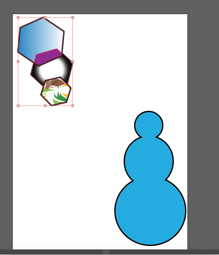
With the shape builder tool you need to create shapes before you can use it. I chose to use two squares with the outline being black and the full colour being blue. You can change colour at the top of the screen towards the left hand corner. I placed one square on top of the other so that they would be able to jin together. To get them together you must then highlight both squares with the selection tool in the left hand corner. Once you have done this you then can use the shape builder tool and draw a line connecting one square to the other and then they should be joined together. The image below shows you one of the first steps into combining the squares. The image below the one underneath, there is a snowman shaped shape, this is the finished project, I changed the shapes halfway through because i wanted to make an easier shape.

The ‘Live Paint Bucket’.
The image below shows to different kind of shapes. the polygons were used for The Live Paint Bucket. First of all i used three different sizes of the same shape using the skills from the shape builder. The i selected the live paint bucket option, which can be found in the same place as the shape builder. Originally the polygons were blue but i used the live paint bucket to put different colours and patterns to break them up.
The ‘Layer Trace‘

This is the original image that i collected from google and I wanted to find an image with many different colours shapes and sizes to play with. So I thought that using an image of a beach then it would all of the colours that I wanted. This image includes a lot of different shapes so I could make small changes for I could change the entire image.
With the layer trace you are able to create a graphic based image with can be a pencil sketch drawn on paper or on a raster image saved in another graphics program by bringing it over to illustrator and tracing over it.

This is now the image on illustrator which has been traced over so that I can change the colour and the shapes. On this image you can see that one shape has a blue outline with small squares around it. This is so I can change the colour of anything that I would like to.

This is now the image but most of the original colours have been changed. Instead of having the blues, purples and oranges, I just wanted to make the image become multicoloured.
What is colour psychology ??
Colour Psychology is the study of colours in relation to human emotion and behavior. It determines whether or not you feel different emotions just by looking at different colours. Colour meanings can have an impact on why we prefer certains things to others. The colour can also have different meanings so that you feel two different emotions at anytime.

Red
The Youtube logo is simple but very bold. It’s bold because it only has two colours and the main one is red because it is the boldest colour that there is which catches the attention to millions of people worldwide. The red gives the logo a bright and attractive look other than just using black and white which will just be plain and simple so people would not use it as much.
Green

This logo is a really known logo. The colour and image just lets people known that this brand is ‘Starbucks’. The colour is not used as much when promoting a business or in a logo because it is not as bright as the other colours but thats why I think that ‘Starbucks’ uses this to their advantage.
Yellow
The colour of this logo is a really bold colour which will catch the eye of customers so check out their stuff and buy something. The design on this logo is really simple but it just shows that not everything need to all full of different things.
Pink

The colour on this logo mostly stand out to girls because it is a shop that only girls will shop at. The font and the colour make is professional and stand out to their customers.
Orange

This logo has changed al lot throughout the years but this is their best logo that they have created because its bright and its simple which will stand out to al lot of customers.
Advertisement Evaluation

We decided to use Disney as put theme for the sponge figurines as we felt like it would apply to children more than using regular figurines as they have less hazards to a child choking, we believe that this product would reduce the risk of children of choking or possibly of them hurting themselves while playing with regular figurines. We decided that the figurines would be suitable being made out of sponges as the sponge is soft so if a toddler or child was tp bite into the toy it wouldn’t hurt their teeth or gums in anyway.
We decided to use this design as there are many vibrant colours, and many character choices to fit any child’s imagination, we believe that this would make a more successful sales and profits for our company as a whole.
I like this design as it’s more child friendly and gives a wide range of characters for every child. I believe that we could add a colored background or some more information about the product to get a better result, we are aiming to grab the attention of the children but also the adults so that they could buy the product as a gift for the child.
To create this poster I used a separate layer for the background which is in the colour which so then it allows the characters to stand out. I then went and found many disney character png’s which i added separately onto the poster the way we wanted it. I added the Disney logo onto the poster as this allowed the poster to also promote Disney. We added text describing the product, a slogan, the price and a picture of the sponge figurines.
Audiences
Primary Audiences
Primary audiences are those who have received the communication directly. The Primary audience is the decision maker. They will be able to choose whether or not they would like to use/watch the platform. This will be for anyone, any age, any gender and different person.
For example,

This will normally be for older people 50+, this will be on around the time that most older people will watching TV during the day/late afternoon.
This will normally be for adults who enjoy watching late night TV.

This will normally be for teenagers and young adults.

This will be for children on midday or just after they finish school or playgroup, but also while they grow up from when they were born to about 5-6 years old. The primary audience is the main target audience.
Secondary Audiences
Secondary audience is the groups who are not likely to see the product but can exert an influence on your primary audience then play an important decision on buying that product.Secondary audience can be anyone such as children, spouses, friends and neighbors.
For example,
This would normally be for girls whose parents would buy these shoes after they have seen them on TV.
This would be for young adults who were told/shown this by their parents or other family members. The secondary audience is the parents or family member as it is not aimed to them.
Group audiences
Group audiences is different products or platforms that many people in a group of friends, family or even strangers. This could be about anything to do with music and films. A group audience is when a advertisement is targeted to multiple people at the same time, with friends, family or class mates. This way of advertisemting is more effective to more people than just showing something that would be just for one person to use.
For example,

This is where different film trailers would be shown before they see movie that you would like. This would be shown to a group of friends and a group of strangers but even if you laugh with people in the cinema then this would we the same as an advertisement.
Individual audiences
Individual audiences refers to a single thing which is just promoted to them and not to a group of people. This would be things like books, podcasts, and in some cases music on your own. This would be helpful for individuals to help them study, read or do many things that they could in everyday life.
For example,
This is an example of how books are advertised for individuals to use wherever they may like. This can be anything an audience consumed by themselves.
Why is it important to identify the different types of audiences??
It is important because if you were to advertise a product for individual use and show it to a group of people, like in a cinema, then they wouldn’t pay attention because they are they’re with a group of people, so if you were to find the correct way to advertise to your audience then your product/company would have a better chance to sell their product.
Persuasive techniques
Emotional Appeal
Appealing to the audiences emotions can be achieved through strong imagery, impactful text or powerful music. An emotional advertising appeal depends more or feelings and perceptions than logic or reason to provoke action. Th9s can be done with any genre of advert whether it’s about children, animals or old people, different people will react to different things so that they all feel the need to help out as much as they can. Here are some examples,
Logic and reason appeal
Advertisements include in the citation of statistics, facts, data, charts, and graphs. This can be helpful with many different companies that want to show you how their product is better than any other, by doing this they will show you different things different that they have like improved cameras or waterproof phones. This is done with many products.
Applying characters to adverts
Celebrity endorsement is a promotional tool that boosts brand awareness. Celebrity endorsement builds credibility and can expose a brand to new markets. The celebrity effect is the ability of famous people to influence others. Companies can use that star power and influence to boost their own products and services.
This is an example of an actor in a advert for the car brand Audi. In the film they really use audi cars because they are involved in as brand deal. But this advert not only shows you what the car does but what film the actor is from, then promoting that film to the public as well as the car.
This is another example of an actor in an advert, but this will only be advertised to men. They use chris Hemsworth because people may think that if Chris can wear it, they they can wear it to so the sales will increase for this particular product.
These are very good ways into getting good sales and profits throughout the release. but to also show the audience at home that not everything that a celebrity uses has to be very expensive. This could also work so that women will see the advert and will decide to buy if for their partners, so they could be just like that.
Worst TV Adverts
Pepsi Advert
Many people didn’t like this commercial that pepsi created because it was based off a woman standing in front of the police and showing them she was doing nothing wrong but they didn’t really think about how this advert would affect the public. People were quick to give their opinion on how this was not the right thing or thing to put into a commercial which talks about a real life problem.
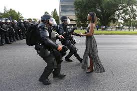
This is the image which the commercial was based off and people didn’t agree with how they used pepsi to solve something which has been going on for centuries. There is a similar image to this were another woman stepped forward to the police during a similar riot and gave them a flower before she was tackled to the ground even though she wasn’t doing anything wrong.

This is a strong image which shows that all they wanted to do is to speak their truth and mind in a way that they were able to. This image shows us how times have changed in the world but their are still some things which are ongoing in people’s lives which we still need to figure out.
BloomingDales Advert

This s another example just as a poster. This was published by a big company similar to John Lewis and they didn’t think that anything was wrong with their poster but the public were soon to jump in a critique what was very wrong with the poster. on the poster it says ‘Spike your BEST FRIEND’S eggnog when they’re not looking’. This was very disliked by . the public because they immediately seen that the poster was telling them to spike a drink which has been an increasing matter in women getting raped from the date drug. This can be very harsh to someone who has gone through this and is not a very good thing to promote to your customers.

This is similar to the picture above where it shows us that you could take the no out of a conversation . This shouldn’t be done anyway but the fact that it is on alcohol bottle makes it a very bad because rape also occurs when alcohol is involved.
Good TV Adverts
This is a John lewis Advert that was published in 2015 and it has become one of the nations favourites adverts from John Lewis. This was an advert that pulled on the heartstrings of many people with different ages, which made it a one which was liked by millions because it showed a little girl who wanted to help a older man see the earth from is house on the moon. This advert is still remembered as one of the best John Lewis Adverts of all time.
This advert was based on a true story showing how World War 1 was unofficially cancelled between the soldiers from both sides of the trenches. They wanted to make a truce for one day and they were singing Christmas songs, playing an instrument and just enjoying Christmas day like they should. The people of the UK really loved this advert because they used this lovely part of history from a really dark time and it worked very well in their favour, this helped them to really show the public that they were able to show a piece of history right in front of them.
Donald Gunn’s types of and styles
There are many types of styles that Donald gunn uses in different adverts but my three favourites are, Parodies, demos and the comparisons.
Parodies
Parody adverts are used regularly to make the audience remember the advert better than a plain and boring one. Most companies use other companies characters or adverts to make the audience laugh. They promote the product but they try to do it in a very funny way.There are many adverts like aldi usae kevin the carrot on a coca cola truck or aldi comparining tea bags with the man of the moon but my favourite is…
This is a scottish advert which is suing the film snowman but they changed the character to fit the scottish stereotype. This advert is promoting the drink Irn-Bru and showing how good the drink is by fighting over it.
There is a sequel which is linked to the story.
This is the same advert but the sequel to finish off the advert.
Demonstration
A product demonstration is to promote the product which is demonstrated to customers. The goal a demonstrating is to introduce customers to the product in hopes of getting them to purchase that item. This is one of the most effective ways to sell a product because people will believe you more when they actually see the product in action. An example is,
This advert show women how to curl your hair with a new and improved hair curler. This shows the customer how easy it is to curl their hair in a fast and effective way.
Comparison
Product Comparison is a simple way to compare product that product to other similar product and then show the product’s abilities. Comparison allows you to determine if your product is better than any other product which is in a similar field. This is also an effective way to show your customers that your product may be cheaper or much better in general so that they can either save money or find something new that they will enjoy. An example of this is…
These adverts show how Aldi’s products are better than the other brands and they try to persuade you to buy their product instead of theirs.
Burger King
What is Burger King?
Burger king is an American multinational chain of burger fast foods. The company was founded in 1954 in Jacksonville, Florida by James McLamore and David Egerton. Their headquarters are stationed in Miami, Florida. Burger King has become one of the most recognised fast food restaurants all over the world, they now have more than 11 Million restaurants around the world.

This is normally what a Burger King advert on Social Media or from a TV advertisement would look like. They would have the classic blue, red and yellow logo which is very appealing to the customers because bright colours shows the customers that this place is a good place to come and visit.
Burger King has many competitors all around the world, for example; Mcdonalds, Wendys and Taco bell. All these have slogans which are memorable to their customers and Burger kings is ‘Home of the Whopper’. This enables the customers to hear this slogan and automatically think of ‘Burger King’.
Burger King was originally named ‘Insta-Burger King’, named by the original owners ‘Keith Kramer’ and ‘Matthew Burns’, but the company did not work out so Keith and Matthew sold it to the current owners and they continue to this day exceed it’s value.
Burger King is the 20th most popular fast food restaurant but the most famous, but some customers say that Burger king is good value for money, good quality, family friendly, Tasty and they are everywhere.
History of the Burger King logo
This is a timeline showing all the different logos that Burger King has used/created. Throughout the years the logo has had many different looks, fonts and colours. All of the logos were created to go well with the times so this timeline does show a lot of history within the company. It also shows how the company has grown and changed with the technology and time in order to create all these different logos. The logos used to be all plain and simple with shows just how popular this fast food restaurant has become. The logo now has got bright primary colours so that they stand out really well, when the older logos had similar colours that could blend into one. My favourite logo newest logo because that is the one that will get people to recognise the brand better.
What do other fast food chains advertise?

This is one Mcdonalds poster that is advertising their breakfast menu. This is a very simple design with a lot of the colour red. Fast food restaurants especially Mcdonalds use the colour red because it stand out the most to customers. The go for a very simplistic look to make it look like they are a very chilled company and not just in your face with the design.

This is one Taco Bell poster. Again Taco Bell also have used the colour red to get their customers intrigued with their new product, this also a little hint of blue which will make the customer intrigued because red an blue go very well together to standout and catch the eye of new customers.
Burger Kings advertisements
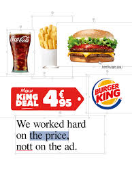
This is one advert which doesn’t standout as much as the others, but this poster does really tell you everything that will need to know, unlike the others, they have included the price but they have really focused on the price of the food and the food not just all on the ad. Burger King is known for their adverts with fuel their rivalry with Mcdonalds, for example,

This advert is not only promoting how they cook their burger but they are bringing in the rivalry that they have with Mcdonalds by saying that they are not able to ‘roast’ them by retaliating.
Bad adverts
Burger King is very well-known for their controversial adverts but a main one is…

This poster is made for adult humour. It is an innuendo that not everybody will understand but so people were not very happy with their decision on this poster. This poster has had a lot of comments and complaints towards it because adults thought it was very unprofessional of Burger King to create this. Although Burger King is a very out going company so maybe they wanted to try something to make adults laugh but it didn’t work on their behalf.
This is another ad which customers did not like and thought was a very racist advert.The advert showed people eating the burgers while using chopsticks. Many people had thought that this advert was something which certain people had pointed out on. Some had put their thoughts online and some people wanted Burger King to make a public apology but that never happened.
Pre-Production
Who are my Target Audience?
My target audience will be a mixture of different age groups and different age ranges. Burger King is mostly advertised to young adults and mature adults. Although, some of the younger children and older generation may still go to these places.
My own research
I made a survey all about and asked many different people and these are the results;
Question 1. Who are the most popular people to eat/go to fast food restaurants?
75% said Teens (Young Adults) . 25% said Adults
The choices were Children, Teens, Adults and The Older Generation
Question 2. Where do you go/eat the most?
75% said Mcdonalds 25% said At a real restaurant
The choices were: Mcdonalds, Burger King, Subway, At a real restaurant or Other
Question 3. Why do you go/eat At fast food restaurants?
75% said With Friends 26% said As a treat
The choices were With Friends, As a treat, Easier, cheaper and Other
Even though it was a short survey I really saw what people thought about Fast Food and how much people actually eat it. My survey was always 75% to 25% which means that there was a selection of people who do the same and the other 25% does something completely different. Th9is shows how much people just eat fast food with their friends because it becomes the easiest option for teens.
My Drawing Drafts

This is my first Drawing draft which shows the well know slogan and a burger surrounded by Red, Orange and Yellow flames.
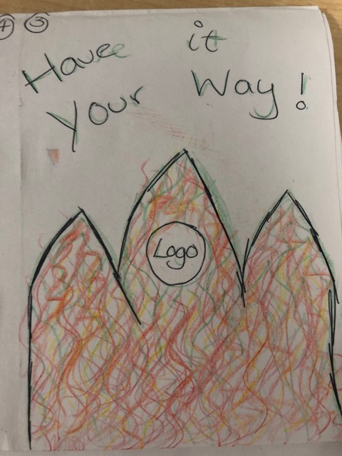
This is my second drawing sketch. I thought that if I were to shape the flames as a crown then it should mask the sense that the crown is on fire.

This is my third drawing sketch. This is a more simple design compared to the rest of my designs. I wanted to keep it simple by surrounding the logo with flames.

What I want my Poster to look like?
I want my Burger King poster to be able to stand out from the previous posters that Burger King have created but still stay along the same lines with the flames/smoke to show that the slogan is true. The slogan ‘Because fire is better’. I will base my poster along the lines of this slogan because i personally believe that Burger King has unique but recognisable slogans that people all over the world have heard of/say. I want to include flames or smoke in my design but i want to choose the original Red, Yellows or Oranges, I want the colours to be Black, purples, blues, hints of green an pink.
Colour components

This is my first colour combination. The reason why I chose these colours is because if I wanted to create a poster for Burger King around Halloween time then these colours would resemble the mysterious and eeriness of the season. I really like this colour combination and I think this could be the final colours for my poster.

This is my second colour combination. The reason why i chose these colours because I wanted them to resemble the colour of flames to represent the slogan. Although, these colours can be seen on mostly every Burger King poster so I don’t think these colours will be my final choice.

This is my final colour combination. The reason I chose these colours is because I wanted the colour scheme to be weird for Burger King so that you will do a double take when you see them on a Burger King poster. This colour scheme was based of the different pastel colours that you would get in spring but I don’t think that I would like this as my final colours because although I wanted them to be different i think its too far away from burger king that it wouldn’t really work well on a poster.
My final colour scheme
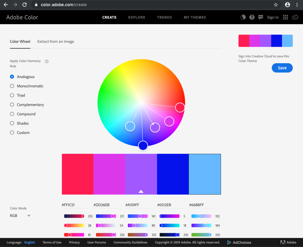
This is the colour combination that I would like to use on my poster because I still would like to remain with the Halloween season feel which I think will have a good effect on its design. These colours
What fonts do I like?
I have chosen my four favourite fonts from the website ‘DaFont Free’. This website has helped me to see what kind of fonts that i like and what i think will work well with the vision for the poster that I have created on paper and in my imagination.

This was the first font that I liked and fitted well. I like this font becasue i seen that there was a sort of edginess to it which would only work for a small portion of different, unique things. The font is so unusual, I think that is why i had taken a like to it. I think that not most people would like this font so I would like to show that within my work and I think this font would help me in what I’m trying to do.

This is the second font that I thought would work really well because I love the graffiti side of anything and I have never seen anything graffiti on a Burger King poster/ advertisement before so this could be a great way to combine the two. Although this text could be useful to may other different brands so it wouldn’t be something that doesn’t appear out of the blue. So this is why I think I wont be using this font.

This is the third font which I thought could work within my poster design, this font is different from this other two above which I really think is a good thing, because al the fonts that I like have a different feel and aesthetic, this is my second favourite because this reminds me of a horror movie which, if I were to have a poster during Halloween season then this font would work really well. I might consider using this font with the Halloween season idea, it may cause people to do a double take when they see that it is a Burger King poster.

I am not to sure about this font, for me I think it is a bit to plain for the idea that I would like to create so, this was something that I liked at the start but after I found others then this one became the last one that I would have chosen.
Which font am I choosing for my final poster?

I chose this font for my final design because this was the one that I was most drawn to, this font has a unique feel to it and I wanted to give it a try on my poster and now I can say that this was the best font that I could have chosen that would work 100% with my poster idea.
What images do I like?
This is the first image that I wanted to use, The reason I wanted to use this image is because I wanted it to show the diversity of the burgers that Burger King produce. But this burger for me doesn’t fit in with my Halloween idea as such, so i don’t think I will be using this image in my final poster.
This is the second image that I wanted to use. The reason why I wanted to use this burger is because it is a smaller burger than what is normally shown so this is also to show the variety of burgers that Burger King creates. I may use this burger in my poster because it has everything that I need to show.

This is the final image i have chosen. The reason why I have chosen this burger is because it is a close up shot of the burger but also it is a very clear and focused image. I think I might use this image in my poster because I can see this image working better with my idea than the others.
The final image I have chosen
I have chosen this image to go on my poster because with the colour scheme that I have chosen I think that it will work well with the font colour and layout all in one. This image is an image which really screams an adve4rt burger and I think that I why I have decided to use this image in my final poster.
My 1st Draft

This is my first poster creation which has some positive and negative aspects to it. The positive points are the flames and the font. These are my favourite things from the poster because they work really well together. The reason why I liked these two things are because they scream hot and bright which is something that you need for this promotion. The negatives were the image of the burger and the layout of the font. The reason why I wasn’t happy with these is because the image of the burger is blurry and the layout of the text was really weird, with now I would like to change so you can read it easier.
My 2nd Draft
This is my second draft of the poster, again there were positives than negatives but mostly positives on this particular draft. This is my favourite so far because it shows the entire Burger King ingredients and part of the meal which is something that you don’t see often. The font on this poster is easier to read but it also gives a horror movie vibe which is different. The red overlay looks like the grill lines from a Burger King burger so I thought that if I were to incorporate this into my design then it will look extra but will relate to the company. I wish that I chose different colour flames to experiment with so that it could have stood out more.
My 3rd Draft

This is my third draft. This has more negative points than positives but the only think I like about this poster is the font. The font is really subtle but has a difference so its not ordinary which I like. The burger and the flames ruin the poster for me because the flames look like they are not real or look really off. The image of the burger is not that clear and in my opinion it doesn’t really look like a burger from Burger King but from a real restaurant which is not what I wanted.
My timeline for my final poster

This is the first part of creating my final Burger King poster. I started by opening up the Adobe Photoshop and selecting an A4 sheet with a black background. To get the templates for the flames I downloaded them from online from the website called ‘Brush-Lovers’. They had multiple selections of different flames but I wanted ones that looked like smoke and flames combined. After I had downloaded the brushes I selected my first colour which was a dark blue the n continue to work my way to the light colours.

This is the image that I put in the poster because I thought that it would work really well with the layout of flames that I wanted to create. I think this image grabs attention and grabs you to loom for more.

This is what the image looks like with the background. The colours of the background and the background of the burger image are different but I will change that towards the end.

This is what the poster now looks like with the dark blue flames and added light blue flames, I wanted to give the illusion that the flames are all different and higher/lower than others.

I now added a pink/red flame to give it the warmth of a real fire and for the flames to stand out even more

This is where I started to put in all the different shades of purple that were placed on my colour scheme that I created before. This is where I started to include the writing with the font that I have chosen.

I placed the Burger King logo in the top right corner and then started to build the flames up the page to give it a fiery feel.

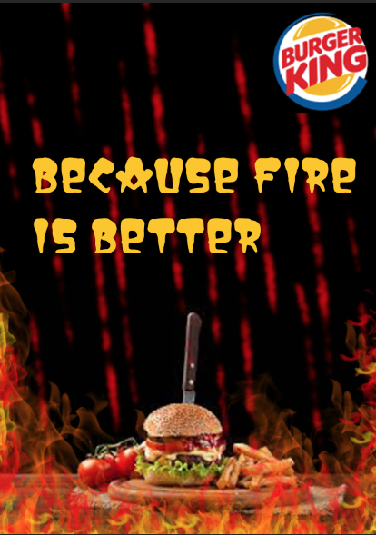
This was the last stage of creating my Burger King poster which I have realised that i didn’t like the title Burger King so I have decided to leave that out and change the slogan
Evaluation

This is my final Burger King poster. I made some changes throughout the process because the more time that I started to use the software and to see the poster come together, some aspects of the poster didn’t not suit the design and made it look abnormal so I decided that I would change some aspects to get the final one. The reason why I changed the slogan is because I realised that it wasn’t their slogan so I changed it to ‘Because Fire is Better’ from ‘Flame is Better’. The slogan makes the poster look better than it was before because it adds some more mystery and just makes the poster look more professional. I also didn’t like the title burger king so I decided to get rid of that because the burger really showed the audience what it was and the logo already said the companies name. The font and image stayed the same because I still think that they work well together. I am really happy with how my final Burger King poster turned out because it does exactly what I wanted it to do. It looks mysterious, eerie and different. I asked some different people what they think about my poster and I had some helpful information and feed back. Some friends said that they would prefer it with Red Orange and Yellow flames. This was helpful because they didn’t connect this poster with Burger King but after I explained it was a halloween poster they really liked the idea better. I think if I were to create this poster again I could include something which shows the customer/target audience that it was a halloween poster not just a random promotion.
